
5 Logo Trends that should stay Far and Away in your Design
Trend. It is that general or noteworthy change that comes in every category between two undefined periods. And this trend does not even possess any fixed time that it may be projected to come. Also, trends occur in every single category present in the world. These include fashion, technology, electronics, industry, business, and more.
Now coming to graphic design and brand identity, this trend fact also holds true. And one of the most important aspects of brand identity is the logo. Now in the case of logo design, the trend has its place but differently.
Trends for logo designing:
Being in trend is a good thing but for a brand logo design, this trend has a catch. Think out in this way. Once you work on the logo for your brand and finalize one best suited one after doing through multiple options. Now, this logo once made into your brand will be there for quite a long time and future years to come.
On the contrary, any design trend that comes will last hardly for a couple of years or so. In that case, falling for new trends while the logo design is not a good choice. Not to mention, you can showcase these latest designs and trends in your packaging design for the products. So do check out these packaging design trends that will dominate for the coming years (link of the previous blog for the same). Also, for a logo, it does not mean that you should ignore them completely. So, there is a sweet spot. Consider inculcating these trends as an option and better focus mainly on the standard stuff for the logo.
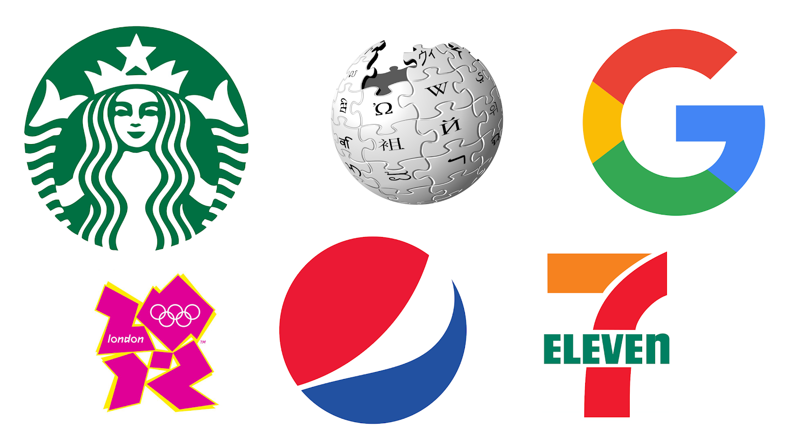
In choosing and landing at the perfect combo it works more like rejecting the ones that do not suit well in order. By doing so, you will be left with only a few options to decide from. Talking about rejections here are X logo designs that you should surely avoid this year. Then, without any further delay let’s get started.
- Gradient Look for your Logo:
In recent times, gradient colors have become so popular that they are being adopted in many different places. Cover of any book, background of your card, website design, and even the last smartphones. In fact, we have also selected gradient as one of the top trends for packaging design.
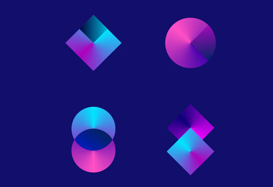
But when it comes to logos, does the same gradient colour scheme hold true and even importantly will it go well. In my opinion, it is no. Because when used in your packaging design it makes sense as you are the one who will be printing it as the package for your product. In terms of the logo, you cannot assure the same.
The logo of your brand will be present on every single thing related to your company. And it may be likely possible that your logo will be under such a place where it will be in black and white. One such example is the printout of the invoice for some orders. Thus, make sure to avoid gradient look for your logos.
Tip: Now to avoid the problem of gradient colours may seem to be left with a handful of colours. But before going with any selection and combination of colours take a step back. First design your brand logo in black and white format and when everything goes well add suitable colours to it.
- Filling up with Colours:
On the note of avoiding gradient shades of colours, you should also not go with tons of colours. Adding a number of colours to just a single logo will make it clumsy. As a matter of fact, colours represent a type of characteristic attached.
For instance, white represents peace, green represents the importance of nature, red represents passion and love and many others can be represented for different colours. This is why, when you opt for a particular colour make sure that it matches your brand’s philosophy and ideology. And just adding a number of colours to the logo is of no use.
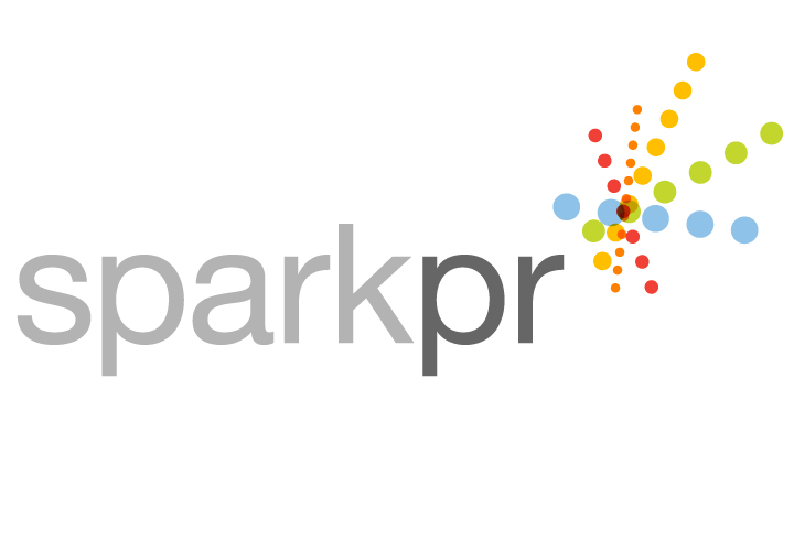
Now, adding a number of colours is often seen in the form of dots. Like the logo contains a set of multi-coloured dots in a certain arrangement. It can be a circle, flower-shaped or just any asymmetrical figure. So, here it makes the viewer unclear of drawing certain thoughts for your brand.
Tip: Here it does not convey that you should not at all go with colours only. In my view, just get colour choices of 2 or at max 3 and arrange them in the range of which matters the most. Like you choose yellow and white so here you can vary the intensity of these colours as per your choice.
- Thin Lines always are not Cool:
Moving on, we have another factor that works well in other factors but not in logo design. Thin lines surely look super cool when brought to design anything such as packaging design, website, the outline of any document, etc. So, in the same way, it should work for logo design right…but it does not.
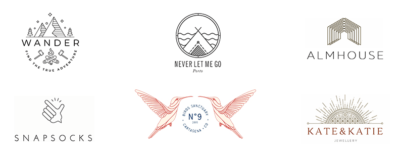
Here’s why. As being a brand logo, it is surely used in a wide range of locations and sizes. It may vary from being placed on a corner of your visiting card to the large billboard used for advertising. This is why there comes an issue with scalability. So, when your logo is being scaled to different sizes then it may be possible that these lines become irregular and do not match with the logo design.
Tip: if you still want to use or have lines in your logo then instead of long and sleek lines use the zig-zag ones. These lines even when scaled does not change its identity thereby not affecting to a great extent to the logo design.
- Do not arc up your logo:
It has been quite some time now that every other logo or design carries its brand name and is followed with an arc over the top. Generally, they seem like a nice touch of design to your brand name. But, in reality, just a brand name and an arc overhead do not make it a logo.
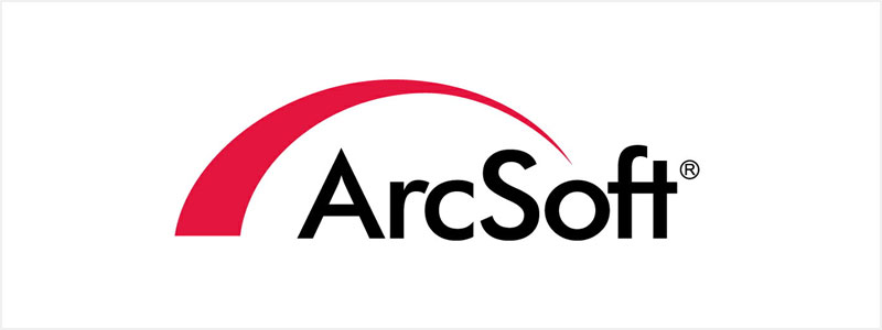
First of all, when you are new to the business, then it is hard to remember your brand name and that is why you went with the decision to design a logo. Now, even at the sake of logos, you are just showcasing your brand name only. And talking about that addition of arc, there are tons of them. In this case, what makes your logo’s arc unique.
Tip: Instead of just adding an arc on the top of the brand name and calling it a logo go with some relatable parameters. For example, add some sort of curves or lines on one side in the background of your logo. It makes a lot more sense than just a mere arc.
- Avoid standard shapes and characters:
Talking about arcing up things here is the next one you should definitely avoid. Just have a thought. Designing a logo for the hospital then adding an image of a human with a happy face and excel. Similarly want a logo for your construction company then just take your brand name and make a roof.
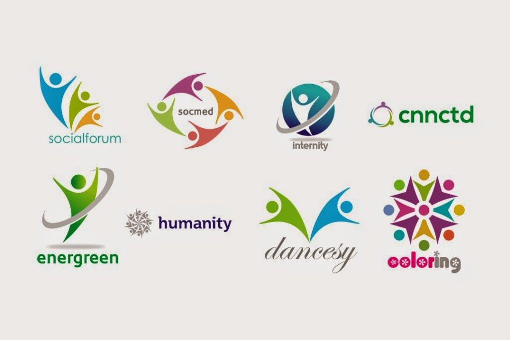
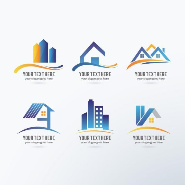
When designing a logo this is what generally happens, you take the brand name in a good type of font and just add a relatable thing to it which matches the company. And you may think, why not? It goes hand in hand with the product and the company.
So, this is where you are going to step in the wrong direction. This technique has been here for a long time and when everybody uses the same technique then the logo of every brand looks the same. After all, where is the factor of uniqueness then?
Tip: Now that you have got the point of adding the same things into your logo design here is what to add. Indeed, you should have some standard shapes but in unique ways such as flowers, geometric shapes, etc.
Closing Words:
Now that you have gone through all the trends that you should avoid for your logo design. I hope it has helped you to eliminate most of the options and left with some noteworthy ones. With this, it surely will make you find and decide the best logo design for your company.
Also, one of the most important steps before going with the logo design is to hire a professional graphic designer. Check this out to get some tips for your small business (link of the previous blog for the same).
On that note, visit my logo design services company at www.dezinenden.com Lastly, looking forward to working with you for the growth of your company and let’s design something great together!
Description:
Being in trend is always a great thing right as you stay updated. Well…not in terms of logo design though. As there is a catch for logo trends. Check out these 5 logo trends that should stay far and away in your design.
