
Logos and Taglines. Talking about any brand to create its awareness among the masses, logos act as a great medium. But at the same time, logos can be considered as a sword with two sharp edges. Meaning if used correctly and efficiently then they prove and make the most for your brand.
On the other side, if you mess up delivering your brand’s ideology in an inappropriate then your company will stand nowhere. By the same token, a perfectly designed logo is so powerful that when it appears at any place this thing will remind you of that company.
Simply speaking, logos can be defined as a representation of any company’s product or idea through a medium.
Moreover, a logo is so effective that it has no barriers to come in its way. Think about it. If you make any commercial or poster, then there may be barriers such as language, level of understanding, etc. Now, when it comes to logo design it breaks all of those barriers and withstands to deliver the most. In the same fashion, designing a great and relatable logo is a tedious task in itself. This is why here are few common mistakes that you should avoid while designing your next logo for the company. With that being said, let’s get started.

1. Follow the Color Model:
Most of you may associate logo designing as an art where it should be eye catchy and attractive. So, with this mind, you associate that logo should be colourful and rich with all the possibilities. Well in my opinion it is halfway correct. I agree with the point that it should be attractive to the eyes.
But forcefully putting in all the shades into one single thing will surely not help. On the contrary, just stick to the least colours. Meaning, do add colours to your logo but make sure that you don’t mess up in the way of being attractive.
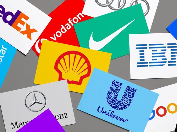
Just give a thought to any famous company or brand and their respective logo. You may wonder and conclude that they are mostly made of 2 to 3 relatable colours only. Also, do keep in mind that the selection of those colours should match your company’s products, packaging and more.
Let’s take an example. Google as we all know, its search engine logo consists of four colours i.e., red, blue, green and yellow at the least. Furthermore, if you pay more attention then most of their products and services follow this colour model. Be it google chrome, news, Gmail, etc. or products like the Google Pixel lineup.
2. Stick to a Font:
After choosing the right colours for your logo designing it’s now time to decide the fonts for something you intend to write on it. A logo does not just mean a mere shape with few colours in it. Now talking about fonts, here also the same colour model story continues. Digging deeper, do not literally mix up all those possible combinations into one single logo. In fact, pick one of the most common font types and just stick to it.

On a side note, you can attempt changes like bold, underline and other stuff to create an impact on one statement in the logo design. Not to mention, these selections of the font must also suit and cope up with your company’s standards in different products. Here’s an example of how a mixture of different fonts would end up messing with the environment and confusing the customers.
3. Simplicity and Clarity:
Talking about confusing the customers, this next point should definitely stick to your mind while creating a logo for the company. As mentioned earlier, logos act as a medium in representing the company’s ideology and purpose of bringing any new product. In the reverse case, what is the use of such a logo which in turn confuses the customers?
In this view, your logo should be as simple and clear as possible. No need to mention all the details of the product in one single logo. Instead, just mention those highlight features which make it stand out from the competition.


Simultaneously, have a side by side look at both of these logos. Which one among these makes more sense? Ultimately, it should be the one on the right, as it is a simple logo of a cleaning service agency with a small mop to illustrate.
4. In the case of Rebranding:
It is very often that in the meantime of your company it may be rebranded due to several reasons. With attention to rebranding, do check here (previous blog on rebranding) to know more about it. Back to the logo designing, you should also be extra careful when redesigning the logo in case of rebranding.
Well, it is good to go with an entirely different look, colours, fonts and even name. But it is strongly not recommended. As one part this thing is highly risky and the other being that following a totally different approach does not even scale that much.

So, in either case, just make sure that you continue your company’s ideas and implement them in the refreshments. If you observe there are many examples of such rebranding cases where the companies have refreshed their logos slowly and effectively as per the time.
5. Copying & Inspiring have a small differentiating line :
If you are one of those entry levels companies or start-ups then this point should rightly strike you. As a basic human tendency, we are always habitual of copying some of the other things that we picked as per our likings.
It can be seen anywhere. Like imitating to be or behave like your favourite actor to copy someone’s work and making some tweaks as if it was original. But in logo designing, this will not at all work. Leave of working out, in turn, may leave you into trouble which you will have hard times coming up. On different aspects, you can do one thing.
Let’s say you liked any logo’s content such as font, colour, tagline, etc. Do just one thing. While designing your very own logo try to inculcate those parameters in your way. All in all, those copied logos into your ones will mislead the people and lower the value of your brand in people’s mindset.

6. Pay Attention to Graphics :
So far, we have discussed all those visual changes or mistakes that you should keep in mind. Now coming to the next point this one is a bit different. After all, this entire designing stuff is related to graphics only. So, speaking of graphics you should make sure that your logos designed are in a vector format. Did not get a clear idea of what is going on? Give me a moment.
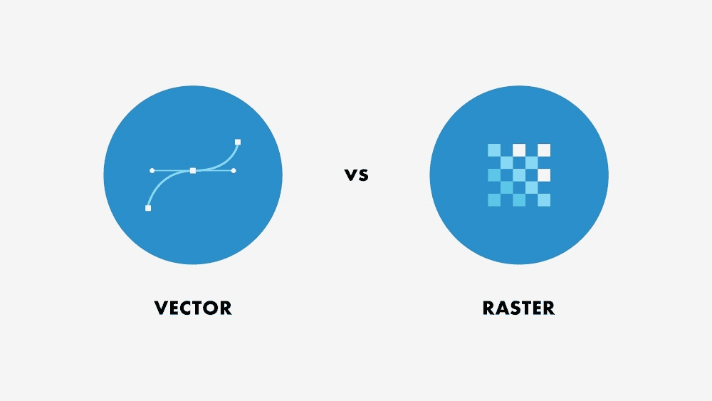
There are broadly two main formats in graphic designing and they are raster format and vector format. Raster format is simply made up of pixels. Meaning any logo or text you design in raster format is nothing but made of pixels with a unique and selective combination of RGB.
On the other hand, vector format as the name says is defined by vectors. Now, these vectors are in the form of lines that describe any shape. In a nutshell, the raster format’s biggest letdown is it becomes blurry for enlarged images or shapes. While those made in vector format are tended to maintain those curvy and sharp edges of the shape in any size.
7. You are not the Master of all Trades:
Lastly, this one is pretty straightforward and simple to state. As you are looking for a better logo design then most likely you are a businessman or manager of your company. So, your field is more limited to business, management, market strategy and other related ones. But when it comes to design one, you are not the right one.
These designing things involve various technical parameters related to a graphic designer. In that light, do invest a decent amount and hire a proper professional in graphic designing as they know it better. Finally, before treating it as an extra cost, just look at the final output. Thereby, you will realize that your money is put in the right direction.

Wrapping all up:
To summarize, we have mentioned all those common mistakes that you make in logo designing. Also, some loopholes which you might have missed to cover up. But in the end, all of these things will be better understood by a person who has better knowledge in that respective field. This is why some capital you pay for that graphic designer will definitely pay you with the best possible output.
On that note, visit my graphic design studio and check my profile to know better about me and my work. With that being said, I am totally looking forward to working for your design needs of the company. And let’s design something great together!
