
Rebranding, as the term itself, says this thing is engaged in refreshing the overall brand. Rebranding can be defined as revamping the entire brand identity.
So, in this article, we will look at and understand the main ideology as well as the need for rebranding. Furthermore, will look into some of the dos and don’ts of rebranding.
Finally, studying 3 rebranding cases of successful companies. On that note, let’s begin.
What is Rebranding?
To start with, the main aim of any company is to expand its reach among the people. For this reason, they although started with one single product or category go on expanding them over time. Now many times, we observe that they do expand their products in a limited and relatable field or category only. Also, this rebranding scenario plays an important role in creating a unique identity among the competitors.
Likewise, it also serves as a good market strategy creating a buzz and hype in the market. Not to mention, each coin has two sides. Though it is true that rebranding is good for business in some cases it may turn out to be risky if not carried carefully.
A Popular and Well-known Example
Lets’ take an example. We all know Coca-Cola, one of the popular brands in cold drinks and beverages.
Actually, at the establishment, even they started with only one single product i.e., the original Coca-Cola. But in the times ahead, as their product gained market share and popularity, they started expanding their lineup.

Coming to the present, we now see different types of beverages from the same company. Not to mention, they have still focused on their original field only, the field of beverages.
Now, with this account of expansion, we have also observed rebranding done in the same direction. And this comes in different aspects such as the location of factories, the strategy applied, market capture, etc.
But to common people, one factor that is widely visible in the process of rebranding is the logo design of the company.
Types of Rebranding
Now that we look over and understood the basic idea and purpose of rebranding. With the supported example to excel better. Now, talking about the types, there are broadly two main categories of rebranding.
● Proactive Rebranding :
Proactive rebranding is merely a rebranding method that any brand adopts whenever there is an opportunity to grow. And this is the most common and well-known category. As the rebranding works itself on this motive to grow its business. One such example of proactive rebranding is from Titan Industries in 2013.
Actually, in 2013, Titan Industries have rebranded itself as Titan Company with a new logo and name scheme. The idea is to create value, innovate, and sustain the highest global standards. Just take a look below:

As observed from the above images, titan industries formerly being a style statement is now rebranded into a personality statement. Not just that, now the company has even diversified and expanded its portfolio into different categories of products. Titan, Sonata, and Fastrack for various watches, Tanishq for jewelry, and others.
● Reactive Rebranding :
Reactive rebranding is more of a necessity focused on existence than on expansion. Let’s put it this way. When any company is being acquired by some big names then this strategy of rebranding is used. The acquisition can be due to multiple reasons such as business deals, bankrupt situations, or strategic partnerships. One of the prime and daily examples of reactive rebranding is Instagram.
When Facebook bought Instagram in 2012 for around $1 billion, they revamped the logo as well as the look and feel. Although both were merely focused on social media, Instagram was meant to be focused on young and energetic generations. For this purpose, they have made significant changes to the logo so as to be up to date with modern people.

Finally, after gathering all the knowledge of rebranding let us look at a few of the successful examples in this rebranding strategy. Likewise, we will break down the entire study into the need for a rebranding and then the result obtained, by doing the rebranding, from the users.
1. State Bank of India (SBI)
Definitely, the State Bank of India is one of the largest and most iconic banks in India. In a situation when anyone wants to create a new bank account, the choice of millions of Indians is to be, undoubtedly, SBI. Meaning, the bank has achieved that level of trust and belief from the customers around the nation.
Now the thing is when such a huge brand is in a situation of rebranding then it has two possible ways. One surely being in expanding its business even more but on the other side a risky moment with such a humungous user base. Not to mention, the result of rebranding is surely the former one. Thus, this one is making it to the list of successful rebranding companies. So, this will be interesting to start with. Firstly, talking about the visual changes, there is a new logo upfront with an even better ideology to carry with the users.
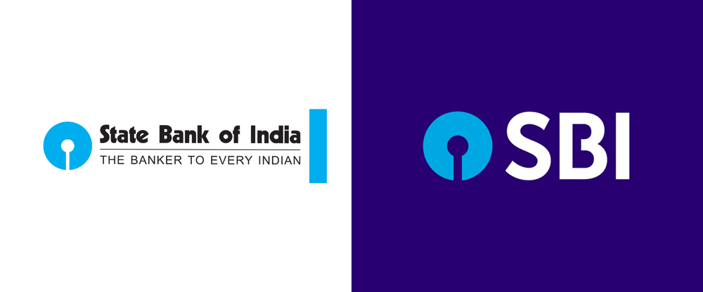

In the very first place, talking about the purpose of this rebranding is digitalization. As we observe that steadily and quickly the world is adopting the online modes. In addition, the usage of digital products and services is increasing at a great pace. So, to cope up with and stay dated with the modern era, SBI has undergone these vital changes in rebranding. As mentioned earlier, we have look over the new yet similar resemblance of the new logo over the old ones.
Moving further, the company has also worked on many under the hood changes in the account of rebranding. SBI has made available its brand-new app namely YONO (you only need one) to its customers. This will bring its customers even closer and interactive to help support. Also, the same goes true with an updated look and feel for its websites, portals, etc.
2. Hutch-Vodafone-Vi
In the next place, we have a rebranding of one of the largest telecommunication operators in India also over the world. Starting with, the initial name was Hutch where the company held with the slogan of ‘Wherever you go, our network follows. And in 2007, Vodafone brought around 67% of stakes in the Indian market for around $13 billion.
From then on, the acquisition went on increasing with more and more shares being brought by Vodafone. Lastly, in 2010 the company was privatized with the entire operation being run under the name of Vodafone Pvt. Ltd.
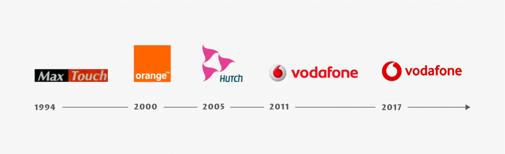

But that not all. If we talk about the recent update, there has been another glimpse of rebranding going on. In early September 2018, the company has announced it is merged with Idea. This means that two major telecom operators in India, Vodafone India and Idea are now Vi. To sum up, all the earlier ones can be stated as proactive rebranding whereas the latest one being reactive rebranding.
3. Apple
Finally, this one will emphasize the fact that not always rebranding needs to be huge at a time. Indeed, a small and subtle improvement over time also matters. This one is Apple. The first phase of rebranding took place with the entry of the new CEO to the company and he is the man himself, Steve Jobs. One thing that Jobs changed immediately is the logo of the company within just a year or so of the introduction.

If you look at the original logo of Apple Inc. it was hardly there in existence as it was one in all to look at. The thing was so confusing that they have incorporated Newton’s scenario of gravitational force discovery.
Ideology-wise, it was great but when any normal people looked at this thing, they found it hard. Also, they were unable to link this company to a certain category of products. All in all, it was a good decision to change the logo.
Starting off pretty standard, they have gone with an apple fruit in the rainbow shade with a name besides. Not to mention, the main reason behind the bite shown is to avoid its confusion with any red fruit especially cherry.
In the same fashion, they have removed the name beside and underwent many changes such as black, classic blue, metallic, and finally ended up with the matte black.
Closing Words
To conclude the entire scenario, rebranding surely helps but it is not mandatory. Also, you should not all go for rebranding falling for false hype. In the end, you have come across how logo designing plays an important role in rebranding.
For this purpose, do readily invest in good yet effective graphic designers who in turn will deliver you with the best output matching the ideology. On that note, visit my graphic design studio and check my profile here for more information.
